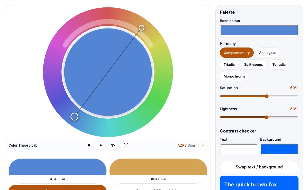
Color Theory Lab
Build colour harmonies on a wheel and check text contrast against WCAG.
What the Color Theory Lab shows
Build colour harmonies on a wheel and check text contrast against WCAG. Free, no signup, runs in your browser. Works on phones and computers. Built for intro to design, the color theory lab runs instantly in your browser: change a setting or drag an object and the result updates at once, so you learn by trying things out rather than only reading about them.
Build colour harmonies on a wheel and check text contrast against the WCAG accessibility rules.
How to use the Color Theory Lab
In the Color Theory Lab, use the controls to change Base colour, Harmony, Saturation, Lightness, Text, and more. The simulation reacts instantly.
In the Color Theory Lab, pick an option such as Complementary, Analogous, Triadic, Split-comp. to switch modes or load an example.
In the Color Theory Lab, press "Swap text / background" to start, reset or change what is happening.
Start with this experiment: Pick a base colour and switch through the harmonies. Drag any glowing handle, object or slider with your mouse or finger and the Color Theory Lab responds in real time.
Change one setting at a time and watch which readout moves, then compare it with this idea: Complementary colours sit opposite each other on the wheel and create strong contrast.
Things to try
Pick a base colour and switch through the harmonies.
Find a text and background pair that passes WCAG AA.
Lower the saturation to see muted palettes.
Copy a palette and paste it into your design.
The science behind it
Complementary colours sit opposite each other on the wheel and create strong contrast.
Analogous colours sit next to each other and feel harmonious.
WCAG asks for a contrast ratio of at least 4.5:1 for normal text and 3:1 for large text.
A worked example with real numbers
ratio = (1 + 0.05) / (0 + 0.05) = 21:1, the maximum
Mid-grey #767676 on white is about 4.5:1, the AA limit.
Tips and common mistakes
Tips
- Try complementary, triadic and analogous harmonies.
- Test your text colours before using them.
Common mistakes
- Judging contrast by eye only.
- Using colour alone to carry meaning.
Where this is used
Designers, artists, web developers and photographers use colour harmony and contrast checks to make brands, interfaces and posters that look good and are readable for everyone.
Who is this simulation for?
Design, art and web students, and beginners learning the basics of colour, layout and accessibility. A good first experiment in the Color Theory Lab: Pick a base colour and switch through the harmonies. The key relation to keep an eye on: contrast ratio = (L1 + 0.05) / (L2 + 0.05), where L is relative luminance; WCAG AA needs 4.5:1 for body text.
For teachers: project the Color Theory Lab on the board, let students predict the result, then run it together and test this: Find a text and background pair that passes WCAG AA. For students: change one thing at a time and write down what changes.
Frequently asked questions
What is a complementary colour?
The colour directly opposite on the colour wheel, 180 degrees away. Pairs like blue and orange create high contrast.
What contrast ratio do I need for accessible text?
WCAG AA needs 4.5:1 for normal text and 3:1 for large text. AAA needs 7:1 and 4.5:1.
Is the Color Theory Lab free to use?
Yes. The Color Theory Lab is free, needs no signup or download and runs in your web browser. It is part of the Intro to Design group of AZRS simulations.
Does the Color Theory Lab work on a phone or tablet?
Yes. The Color Theory Lab takes touch input as well as mouse input, so you can use its 6 adjustable settings with a finger. A larger screen makes the controls and graphs easier to read.