Digital Wellbeing could get multi-app timers, a new dashboard, Bedtime mode tweaks, and more
For a tool that’s supposed to help you track your screen time and reduce it, Digital Wellbeing’s UI sure does promote the opposite. This hasn’t really been a concern up until now, mainly because we’v…
Affiliate links on Android Authority may earn us a commission. Learn more.
For a tool that’s supposed to help you track your screen time and reduce it, Digital Wellbeing’s UI sure does promote the opposite. This hasn’t really been a concern up until now, mainly because we’ve been content with what the app offers. However, now that we’ve gotten an early look at how much better Digital Wellbeing could be, it’s going to be difficult to go back.
We’ve spotted Google working on several Digital Wellbeing UI changes — changes that could finally bring an Expressive makeover to the screen-time monitoring app.
You’re reading an Authority Insights story. Authority Insights brings you all the latest exclusive reports, app teardowns, leaks, and in-depth tech coverage from the Android Authority team that you won’t find anywhere else.
For reference, we already found clues hinting at a new Weekly wrap feature for Digital Wellbeing within the app’s latest version 1.47.964183037.beta build. Now, the same build also points at Google redesigning UI for the app’s timers, Bedtime mode, and app activity.
Starting with what shows up first when you access Digital Wellbeing, from top to bottom, the app activity details section could be getting a redesigned dashboard.
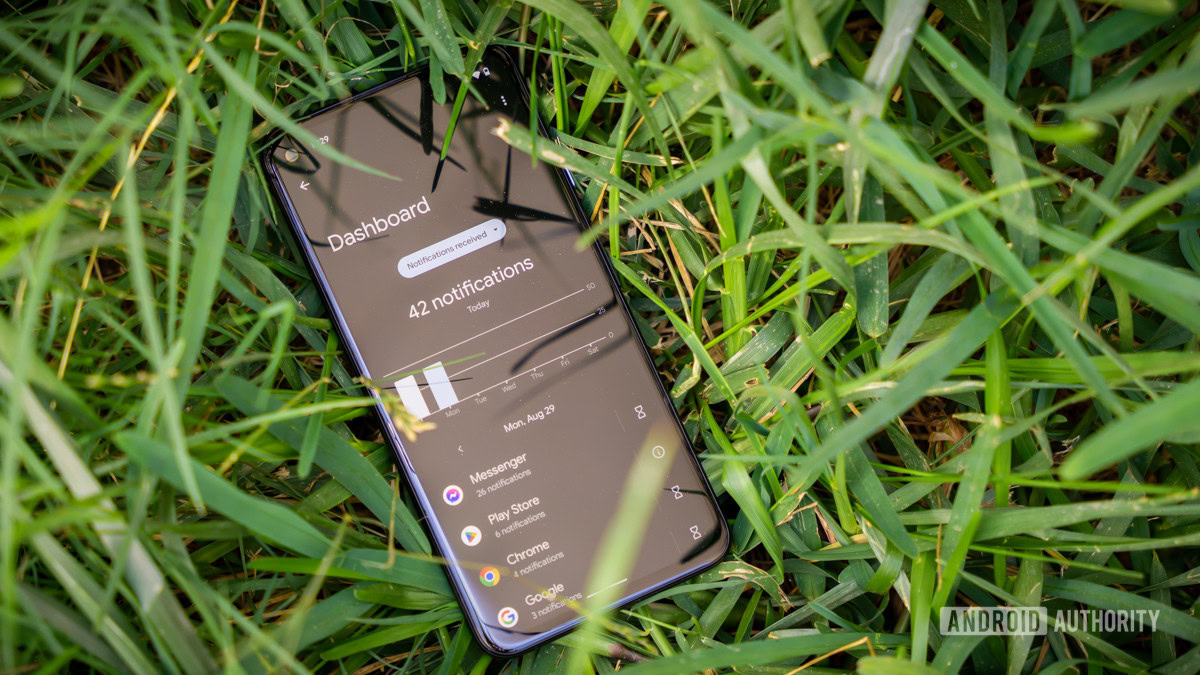
Currently, when you open the section, you see the “screen time” dropdown chip right in the center, followed by usage stats and a weekly graph. Tapping an app highlights its usage stats in a similar UI, as seen in the first two screenshots below. With what Google is cooking, the chip could be moved to the side, complete with the screen time stats and the weekly graph being bundled together in a rectangular card, as seen in the latter two screenshots.
Apps underneath the graph could appear as individual cards, instead of appearing as a continuous list. Plus, it looks like Google wants this page to look less busy, and it’s working toward that goal by getting rid of the timer and information icons that currently sit alongside every app. Accessing those icons could soon require you to tap the listed apps’ name, adding one extra step to an already multi step procedure.
Read Full Story at Android Authority →